An Introduction to the Harrell“verse”: Predictive Modeling using the Hmisc and rms Packages
This is post is to introduce members of the Cincinnati Children’s Hospital Medical Center R Users Group (CCHMC-RUG) to some of the functionality provided by Frank Harrell’s Hmisc and rms packages for data description and predictive modeling. For those of you who have worked with these packages before, hopefully we will cover something new. Dr. Harrell is the founding chair of the Department of Biostatistics at Vanderbilt University (until 2017), Fellow of the American Statistical Association, and a member of the R Foundation. A full biography and list of his numerous accomplishments and honors can be found on his Vanderbilt University webpage.
I titled the post An Introduction to the Harrell“verse”, because like the tidyverse, these packages are a tremendous resource for the R community; share an underlying grammar and data structure; and reflect the opinioned philosophy of the developer. I also like the term Harrell“verse” because the Hmisc and rms packages link users to a much broader set of materials on modern statistical methods and computing including predictive modeling, estimation, hypothesis testing, and study design. I have no idea how he finds the time to develop these rich and intensive resources, and share his thoughts on social media and elsewhere, but his contributions open-source software and insight into the application of statistical methods are much appreciated! Links to many of these materials can be found at his webpage. A few highlights include:
- His Statistical Thinking blog
- The Regression Modeling Strategies textbook, courses, and course notes. I have taken both his 1-day and full week courses and highly recommend them!
- Biostatistics for Biomedical Research e-book
- datamethods webpage
- Numerous contributions on stackexchange
- He also is extremely active on twitter
- And as of recent, leads a weekly one-hour live webinar on applied statistics/biostatistics
My goal for this RUG session is to briefly introduce you to some of the functionally of the Hmisc and rms packages that I think will be of interest to anyone performing statistical modeling in R. These examples are shown at a high-level and are not meant to demonstrate “best practices” with respect to model building and validation, etc. They just serve to show some of the tools these package can help you bring to bear on a project once working in the Harrell“verse”.
Below, I present various functions found in these packages as a series of five tips These “tips” just scratch the surface of the what is possible with Hmisc and rms, but I hope serve to highlight how model complexity can be more easily incorporated when fitting generalized linear models, fitted models visualized, and predictions made and validated when using these packages. Topics covered include:
- Examining your data with Hmisc
- Regression modeling allowing for complexity with rms
- Validating fitted models with rms::validate() and rms:calibrate()
- Penalized regression with rms::pentrace()
- Models other than OLS for continuous or semi-continuous Y in rms
I highly recommend reading Professor Harrell’s Regression Modeling Strategies textbook (2nd edition) and course notes to learn more. Both texts provide detailed code and explanations and Chapter 6 of the textbook is devoted to R and the rms package.
The data used in the examples below come from the UCI Machine Learning Repository (https://archive.ics.uci.edu/ml/datasets/Wine) and can be accessed via the ucidata R package found on James Balamuta’s github repository. We will be trying to predict whether a wine is red or white from a set of 13 features. A description of the dataset from the UCI website is provided below.
Data Set Information:

These data are the results of a chemical analysis of wines grown in the same region in Italy but derived from three different cultivars. The analysis determined the quantities of 13 constituents found in each of the three types of wines.

I think that the initial data set had around 30 variables, but for some reason I only have the 13 dimensional version. I had a list of what the 30 or so variables were, but a.) I lost it, and b.), I would not know which 13 variables are included in the set.

The attributes are (dontated by Riccardo Leardi, riclea '@' anchem.unige.it )
1) Alcohol
2) Malic acid
3) Ash
4) Alcalinity of ash
5) Magnesium
6) Total phenols
7) Flavanoids
8) Nonflavanoid phenols
9) Proanthocyanins
10)Color intensity
11)Hue
12)OD280/OD315 of diluted wines
13)Proline

In a classification context, this is a well posed problem with "well behaved" class structures. A good data set for first testing of a new classifier, but not very challenging.

Attribute Information:

All attributes are continuous
Installing and loading packages
#Install ucidata package from github
#devtools::install_github("coatless/ucidata")

#Load packages
library("tidyverse"); packageVersion("tidyverse")
## [1] '1.3.0'library("rms"); packageVersion("rms")## [1] '6.0.1'library("ucidata"); packageVersion("ucidata")## [1] '0.0.3'library("cowplot"); packageVersion("cowplot")## [1] '1.1.0'
Loading example dataset
Now that the ucidata package is loaded, we can call the wine data set using the base R function data(). We will also create a binary indicator for red_wine that will serve as our outcome variable where “red wine” == 1 and “white wine” == 0. The variable “color” is dropped from the data.frame using dplyr::select().
#Load wine data
data(wine)

#Recode outcome
mydata <- wine %>%
  dplyr::mutate(red_wine = ifelse(color == "Red", 1, 0)) %>%
  dplyr::select(-color)
Tip 1. Examining your data with Hmisc
The Hmisc package has some excellent functions to help you understand your data in terms of the distribution of variables, levels of categorical variables, number of missing values, etc. It also has some very useful commands to help visualize this information. Below are a few of the functions I use most often.
Hmisc::describe()
Describe is a very handy function that allows one to…as you might expect…describe a data.frame. It will provide information on the count, number of missing values, and distinct values, as well as describe and plot the distribution of continuous values. For categorical variables the number of levels and counts are also provided. I find myself using the function as a first pass to look for implausible values in a data.frame, get a feel for the extent of missing data, and to quickly access specific quantiles for a set of predictors. The code below will generate and plot this information. The html options are provided to improve the formatting.
d <- Hmisc::describe(mydata)
html(d, size = 80, scroll = TRUE)13 Variables 6497 Observations
fixed_acidity

| n | missing | distinct | Info | Mean | Gmd | .05 | .10 | .25 | .50 | .75 | .90 | .95 |
|---|---|---|---|---|---|---|---|---|---|---|---|---|
| 6497 | 0 | 106 | 0.999 | 7.215 | 1.32 | 5.7 | 6.0 | 6.4 | 7.0 | 7.7 | 8.8 | 9.8 |
volatile_acidity

| n | missing | distinct | Info | Mean | Gmd | .05 | .10 | .25 | .50 | .75 | .90 | .95 |
|---|---|---|---|---|---|---|---|---|---|---|---|---|
| 6497 | 0 | 187 | 0.999 | 0.3397 | 0.1716 | 0.16 | 0.18 | 0.23 | 0.29 | 0.40 | 0.59 | 0.67 |
citric_acid

| n | missing | distinct | Info | Mean | Gmd | .05 | .10 | .25 | .50 | .75 | .90 | .95 |
|---|---|---|---|---|---|---|---|---|---|---|---|---|
| 6497 | 0 | 89 | 0.999 | 0.3186 | 0.1571 | 0.05 | 0.14 | 0.25 | 0.31 | 0.39 | 0.49 | 0.56 |
residual_sugar

| n | missing | distinct | Info | Mean | Gmd | .05 | .10 | .25 | .50 | .75 | .90 | .95 |
|---|---|---|---|---|---|---|---|---|---|---|---|---|
| 6497 | 0 | 316 | 1 | 5.443 | 4.958 | 1.2 | 1.3 | 1.8 | 3.0 | 8.1 | 13.0 | 15.0 |
chlorides

| n | missing | distinct | Info | Mean | Gmd | .05 | .10 | .25 | .50 | .75 | .90 | .95 |
|---|---|---|---|---|---|---|---|---|---|---|---|---|
| 6497 | 0 | 214 | 1 | 0.05603 | 0.02869 | 0.028 | 0.031 | 0.038 | 0.047 | 0.065 | 0.086 | 0.102 |
free_sulfur_dioxide

| n | missing | distinct | Info | Mean | Gmd | .05 | .10 | .25 | .50 | .75 | .90 | .95 |
|---|---|---|---|---|---|---|---|---|---|---|---|---|
| 6497 | 0 | 135 | 1 | 30.53 | 19.51 | 6 | 9 | 17 | 29 | 41 | 54 | 61 |
total_sulfur_dioxide

| n | missing | distinct | Info | Mean | Gmd | .05 | .10 | .25 | .50 | .75 | .90 | .95 |
|---|---|---|---|---|---|---|---|---|---|---|---|---|
| 6497 | 0 | 276 | 1 | 115.7 | 64.31 | 19 | 30 | 77 | 118 | 156 | 188 | 206 |
density

| n | missing | distinct | Info | Mean | Gmd | .05 | .10 | .25 | .50 | .75 | .90 | .95 |
|---|---|---|---|---|---|---|---|---|---|---|---|---|
| 6497 | 0 | 998 | 1 | 0.9947 | 0.003388 | 0.9899 | 0.9907 | 0.9923 | 0.9949 | 0.9970 | 0.9984 | 0.9994 |
pH

| n | missing | distinct | Info | Mean | Gmd | .05 | .10 | .25 | .50 | .75 | .90 | .95 |
|---|---|---|---|---|---|---|---|---|---|---|---|---|
| 6497 | 0 | 108 | 1 | 3.219 | 0.1802 | 2.97 | 3.02 | 3.11 | 3.21 | 3.32 | 3.42 | 3.50 |
sulphates

| n | missing | distinct | Info | Mean | Gmd | .05 | .10 | .25 | .50 | .75 | .90 | .95 |
|---|---|---|---|---|---|---|---|---|---|---|---|---|
| 6497 | 0 | 111 | 0.999 | 0.5313 | 0.1556 | 0.35 | 0.37 | 0.43 | 0.51 | 0.60 | 0.72 | 0.79 |
alcohol

| n | missing | distinct | Info | Mean | Gmd | .05 | .10 | .25 | .50 | .75 | .90 | .95 |
|---|---|---|---|---|---|---|---|---|---|---|---|---|
| 6497 | 0 | 111 | 0.999 | 10.49 | 1.348 | 9.0 | 9.1 | 9.5 | 10.3 | 11.3 | 12.3 | 12.7 |
quality

| n | missing | distinct | Info | Mean | Gmd |
|---|---|---|---|---|---|
| 6497 | 0 | 7 | 0.877 | 5.818 | 0.9233 |
 Value          3     4     5     6     7     8     9
 Frequency     30   216  2138  2836  1079   193     5
 Proportion 0.005 0.033 0.329 0.437 0.166 0.030 0.001
red_wine
| n | missing | distinct | Info | Sum | Mean | Gmd |
|---|---|---|---|---|---|---|
| 6497 | 0 | 2 | 0.557 | 1599 | 0.2461 | 0.3711 |
As you can see, much useful descriptive information is printed to the console. You can plot the histograms for these predictors separately using the plotting commands below.
p <- plot(d)
p$Continuous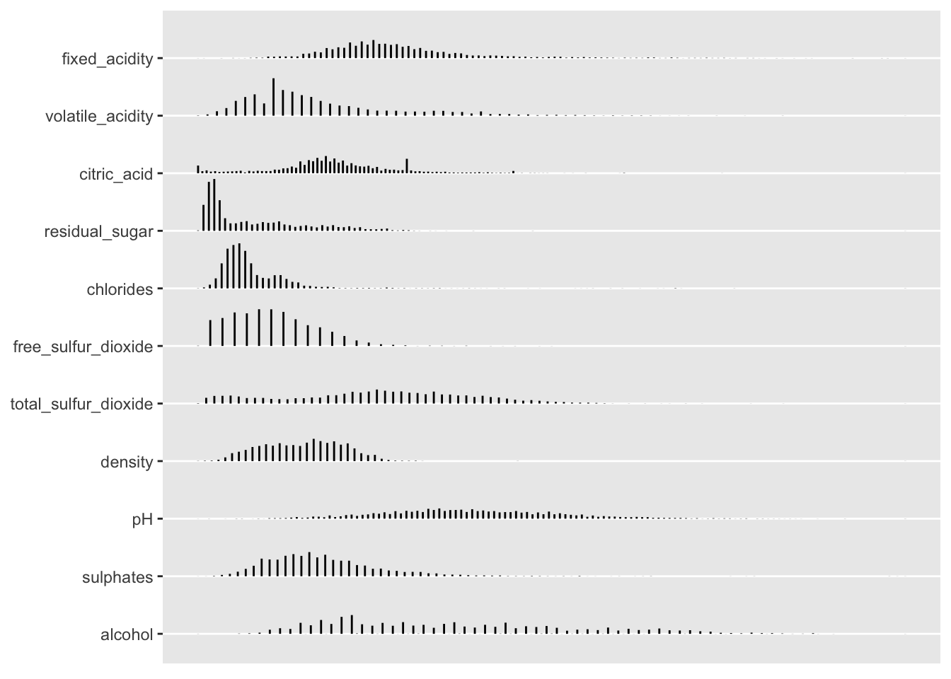
Hmisc::summaryM() to obtain a table of predictors stratified by outcome
Hmisc::summaryM() summarizes the variables listed in an S formula, computing descriptive statistics and optionally statistical tests for group differences. This function is typically used when there are multiple left-hand-side variables that are independently against by groups marked by a single right-hand-side variable (from help).
I find summaryM can provide a great “head start” to generating a “Table 1” for a manuscript. However, one should think about the information that is being conveyed when providing a table of unconditional tests via the test = TRUE option. Differences between the unconditional and the conditional estimates can be a source of confusion (or at least may end up requiring a longer than needed explanation) when both are presented. Moreover, one should think hard about whether or not to include formal tests if the study was not specifically designed to test these factors (and whether the p-values actually provide useful information). I am including the test = TRUE option here just to highlight this functionality.
s <- Hmisc::summaryM(fixed_acidity + volatile_acidity + citric_acid + residual_sugar + chlorides + free_sulfur_dioxide +
              total_sulfur_dioxide+ density + pH + sulphates + alcohol + quality  ~ red_wine, data = mydata,
              overall = TRUE, test = TRUE, continuous = 5)


html(s, caption='Predictors according to wine type',
     exclude1 = TRUE, npct = 'both', digits = 2,
prmsd = TRUE, brmsd = TRUE, msdsize = mu$smaller2)| Predictors according to wine type. | ||||
| 0 N=4898 |
1 N=1599 |
Combined N=6497 |
Test Statistic |
|
|---|---|---|---|---|
| fixed_acidity | 6.30 6.80 7.30 6.85 ± 0.84 |
7.10 7.90 9.20 8.32 ± 1.74 |
6.40 7.00 7.70 7.22 ± 1.30 |
F1 6495=1421, P<0.001 |
| volatile_acidity | 0.21 0.26 0.32 0.28 ± 0.10 |
0.39 0.52 0.64 0.53 ± 0.18 |
0.23 0.29 0.40 0.34 ± 0.16 |
F1 6495=3637, P<0.001 |
| citric_acid | 0.27 0.32 0.39 0.33 ± 0.12 |
0.09 0.26 0.42 0.27 ± 0.19 |
0.25 0.31 0.39 0.32 ± 0.15 |
F1 6495=173, P<0.001 |
| residual_sugar | 1.7 5.2 9.9 6.4 ± 5.1 |
1.9 2.2 2.6 2.5 ± 1.4 |
1.8 3.0 8.1 5.4 ± 4.8 |
F1 6495=458, P<0.001 |
| chlorides | 0.036 0.043 0.050 0.046 ± 0.022 |
0.070 0.079 0.090 0.087 ± 0.047 |
0.038 0.047 0.065 0.056 ± 0.035 |
F1 6495=5156, P<0.001 |
| free_sulfur_dioxide | 23 34 46 35 ± 17 |
7 14 21 16 ± 10 |
17 29 41 31 ± 18 |
F1 6495=2409, P<0.001 |
| total_sulfur_dioxide | 108 134 167 138 ± 42 |
22 38 62 46 ± 33 |
77 118 156 116 ± 57 |
F1 6495=5473, P<0.001 |
| density | 0.9917 0.9937 0.9961 0.9940 ± 0.0030 |
0.9956 0.9968 0.9978 0.9967 ± 0.0019 |
0.9923 0.9949 0.9970 0.9947 ± 0.0030 |
F1 6495=1300, P<0.001 |
| pH | 3.09 3.18 3.28 3.19 ± 0.15 |
3.21 3.31 3.40 3.31 ± 0.15 |
3.11 3.21 3.32 3.22 ± 0.16 |
F1 6495=829, P<0.001 |
| sulphates | 0.41 0.47 0.55 0.49 ± 0.11 |
0.55 0.62 0.73 0.66 ± 0.17 |
0.43 0.51 0.60 0.53 ± 0.15 |
F1 6495=2101, P<0.001 |
| alcohol | 9.5 10.4 11.4 10.5 ± 1.2 |
9.5 10.2 11.1 10.4 ± 1.1 |
9.5 10.3 11.3 10.5 ± 1.2 |
F1 6495=1.8, P=0.18 |
| quality | 5.00 6.00 6.00 5.88 ± 0.89 |
5.00 6.00 6.00 5.64 ± 0.81 |
5.00 6.00 6.00 5.82 ± 0.87 |
F1 6495=100, P<0.001 |
|
a b c represent the lower quartile a, the median b, and the upper quartile c for continuous variables. x ± s represents X ± 1 SD. Test used: Wilcoxon test . | ||||
Spike histograms with Hmisc::histSpikeg(), ggplot, and cowplot
Dr. Harrell’s histSpikeg function provides a very powerful approach to visualize the univariable association between a continuous predictor and binary outcome. It does this by binning the continuous x variable into equal-width bins and then computing and plotting the frequency counts of Y within each bin. The function then displays the proportions as a vertical histogram with a lowess curve fit to the plot. histSpikeg allows this functionality to be added as a ggplot layer.
Here I am combing the plots into a single figure using Claus Wilke’s cowplot package plot_grid() function.
dd <- datadist(mydata)
options(datadist = "dd")

a <- ggplot(mydata, aes(x = alcohol, y = red_wine)) +
  Hmisc::histSpikeg(red_wine ~ alcohol, lowess = TRUE, data = mydata) +
  labs(x = "\nAlcohol Content", y = "Probability(Red Wine)\n")

b <- ggplot(mydata, aes(x = citric_acid, y = red_wine)) +
    Hmisc::histSpikeg(red_wine ~ citric_acid, lowess = TRUE, data = mydata) +
    labs(x = "\nCitric Acid", y = "Probability(Red Wine)\n")

c <- ggplot(mydata, aes(x = sulphates, y = red_wine)) +
    Hmisc::histSpikeg(red_wine ~ sulphates, lowess = TRUE, data = mydata) +
    labs(x = "\nSulphates", y = "Probability(Red Wine)\n")

cowplot::plot_grid(a, b, c,  nrow = 1, ncol = 3, scale = .9, labels = "AUTO")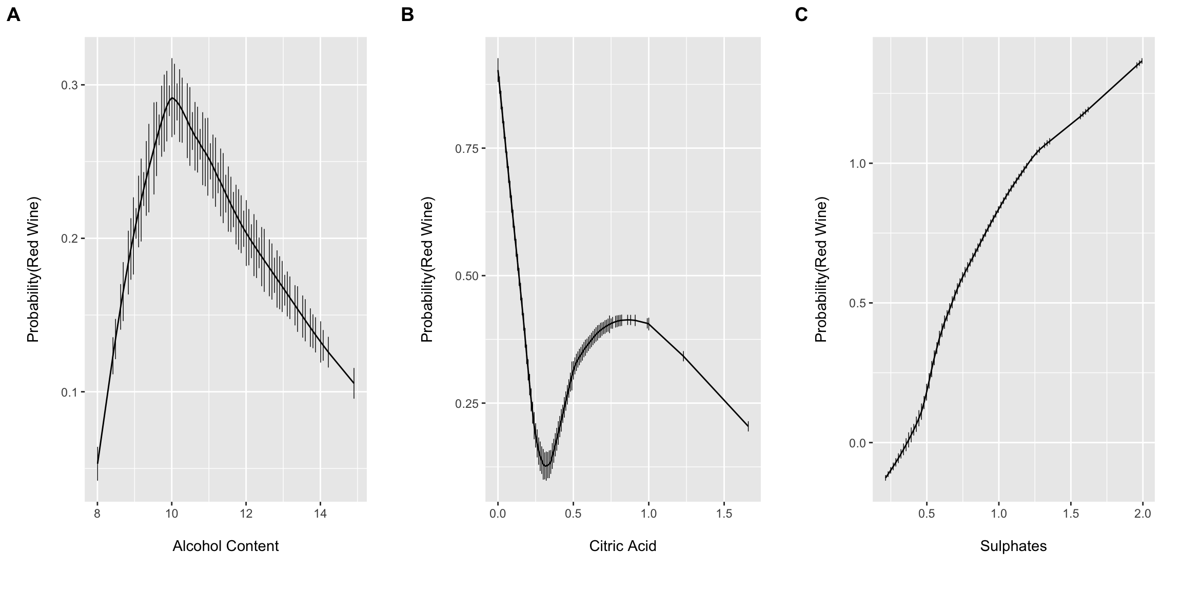
These plots suggest that allowing for complexity/flexibly of the right hand side of the linear model equation may provide improved performance. However, Dr. Harrell has argued (convincingly IMO) that including non-linear terms for continuous predictors should typically be default practice since 1.) truly linear functional forms are probably the expectation more so than the rule (at least for most biomedical phenomena) and 2.) you will likely have more success and “miss small” when including non-linear terms if the true association happens to be linear than if the true association is highly non-linear and one models the association with a simple linear term (i.e. fits a linear term to a u-shaped association diminishing model performance). The cost, of course, is a few model degrees of freedom and the possibility for overfitting…which we will come back to latter.
Visualizing patterns of missing data with Hmisc::naplot and Hmisc::naclus
While there are no missing values in these data, the Hmisc package has several nice features to assess and visualize the extent of missing data and patterns of missing data among variables. Here we will use the dplyr::mutate() function to set some of the values to missing. Then the naplot function is used to plot the proportion of missing values for each variable in the dataset and the naclus function is used to assess patterns of “missingness” among variables. This information can be very helpful to understand why values might be missing and to inform imputation strategies.
While there is no need to impute missing values in this example, the Hmisc:: aregImpute function provides a rigorous approach to handling missing data via multiple imputation using additive regression with various options for bootstrapping, predictive mean matching, etc. Multiple imputations can then be properly combined using Rubin’s rules via the fit.mult.impute function. This function can also be used with output from Stef van Buuren’s MICE package.
missing_df <- mydata %>%
  dplyr::mutate(fixed_acidity = ifelse(row_number() %in% c(1:100), NA, fixed_acidity),
         volatile_acidity = ifelse(row_number() %in% c(1:200), NA, volatile_acidity),
         citric_acid = ifelse(row_number() %in% c(50:400), NA, citric_acid),
         residual_sugar = ifelse(row_number() %in% c(1000:1050), NA, residual_sugar),
         chlorides = ifelse(row_number() %in% c(1000:1100), NA, chlorides))


par(mfrow = c(1,2))
na_patterns <- Hmisc::naclus(missing_df)
Hmisc::naplot(na_patterns, 'na per var')
plot(na_patterns)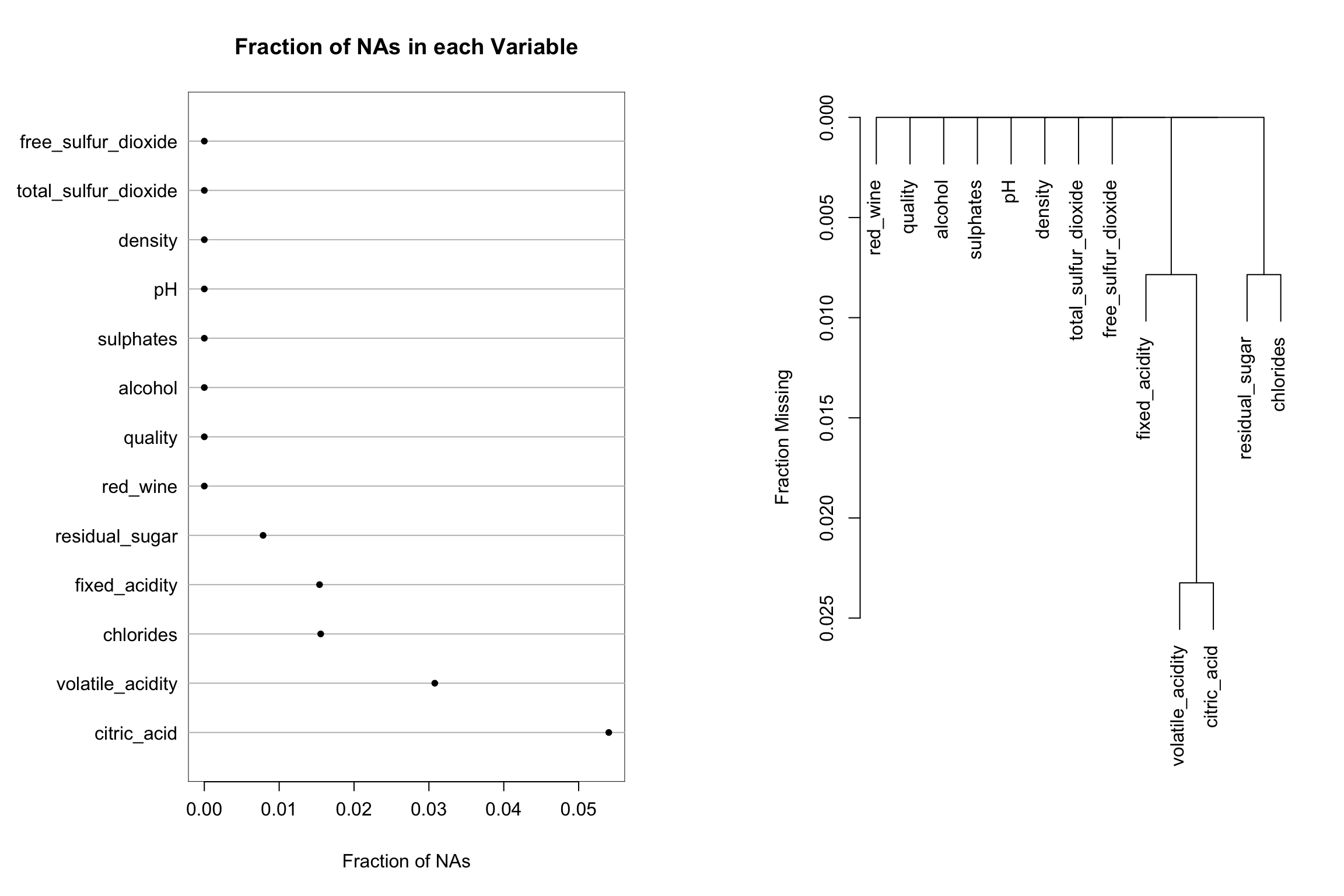
Tip 2. Regression modeling allowing for complexity with rms
The Hmisc and rms packages were recommend to me some time ago when I was looking for better approaches (than say base R functions…as good as they are) to incorporate non-linear terms and interactions into a generalized linear model framework. The rms package makes adding such complexity extremely accessible with reasonable defaults. Professor Harrell discusses the use of restricted cubic spline terms (natural splines) to relax the assumption of linearity for continuous predictors, as well as some of the advantages of constraining the spline function to be linear in the tails in Chapter 2 of the second edition of his Regression Modeling Stratigies textbook. He also provides a detailed description regarding the number and placement of knots that I found quite informative. I typically stick with the recommend default knot placement unless I have good reason to do otherwise, but alternative placement can be easily accommodated.
The rms package also eases the programming required to fit and test interaction terms (using anova.rms) and recognizes syntax of the forms below which were taken from Cole Beck’s rms tutorial:
- y ~ a:b, : indicates the interaction of a and b
- y ~ a*b, equivalent to y ~ a+b+a:b
- y ~ (a+b)^2, equivalent to y ~ (a+b)*(a+b)
- and the restricted interaction term %ia% that for non-linear predictors is not doubly nonlinear in the interaction
The code below will fit an additive model to the full set of predictors allowing for flexibility using restricted cubic splines fit via the rms::rcs() function.
m0 <- lrm(red_wine ~ rcs(fixed_acidity, 4) + rcs(volatile_acidity, 4) + rcs(citric_acid, 4) + rcs(residual_sugar, 4) +
          rcs(chlorides, 4) + rcs(free_sulfur_dioxide, 4) + rcs(total_sulfur_dioxide, 4) + rcs(density, 4) + rcs(pH, 4) +
          rcs(sulphates, 4) + rcs(alcohol, 4) + rcs(quality, 3),
          data = mydata, x = TRUE, y = TRUE)
print(m0, coef = FALSE)
## Logistic Regression Model
##
## lrm(formula = red_wine ~ rcs(fixed_acidity, 4) + rcs(volatile_acidity,
## 4) + rcs(citric_acid, 4) + rcs(residual_sugar, 4) + rcs(chlorides,
## 4) + rcs(free_sulfur_dioxide, 4) + rcs(total_sulfur_dioxide,
## 4) + rcs(density, 4) + rcs(pH, 4) + rcs(sulphates, 4) + rcs(alcohol,
## 4) + rcs(quality, 3), data = mydata, x = TRUE, y = TRUE)
##
## Model Likelihood Discrimination Rank Discrim.
## Ratio Test Indexes Indexes
## Obs 6497 LR chi2 7008.47 R2 0.981 C 0.999
## 0 4898 d.f. 35 g 8.879 Dxy 0.997
## 1 1599 Pr(> chi2) <0.0001 gr 7178.012 gamma 0.998
## max |deriv| 1e-05 gp 0.371 tau-a 0.370
## Brier 0.004plot(anova(m0))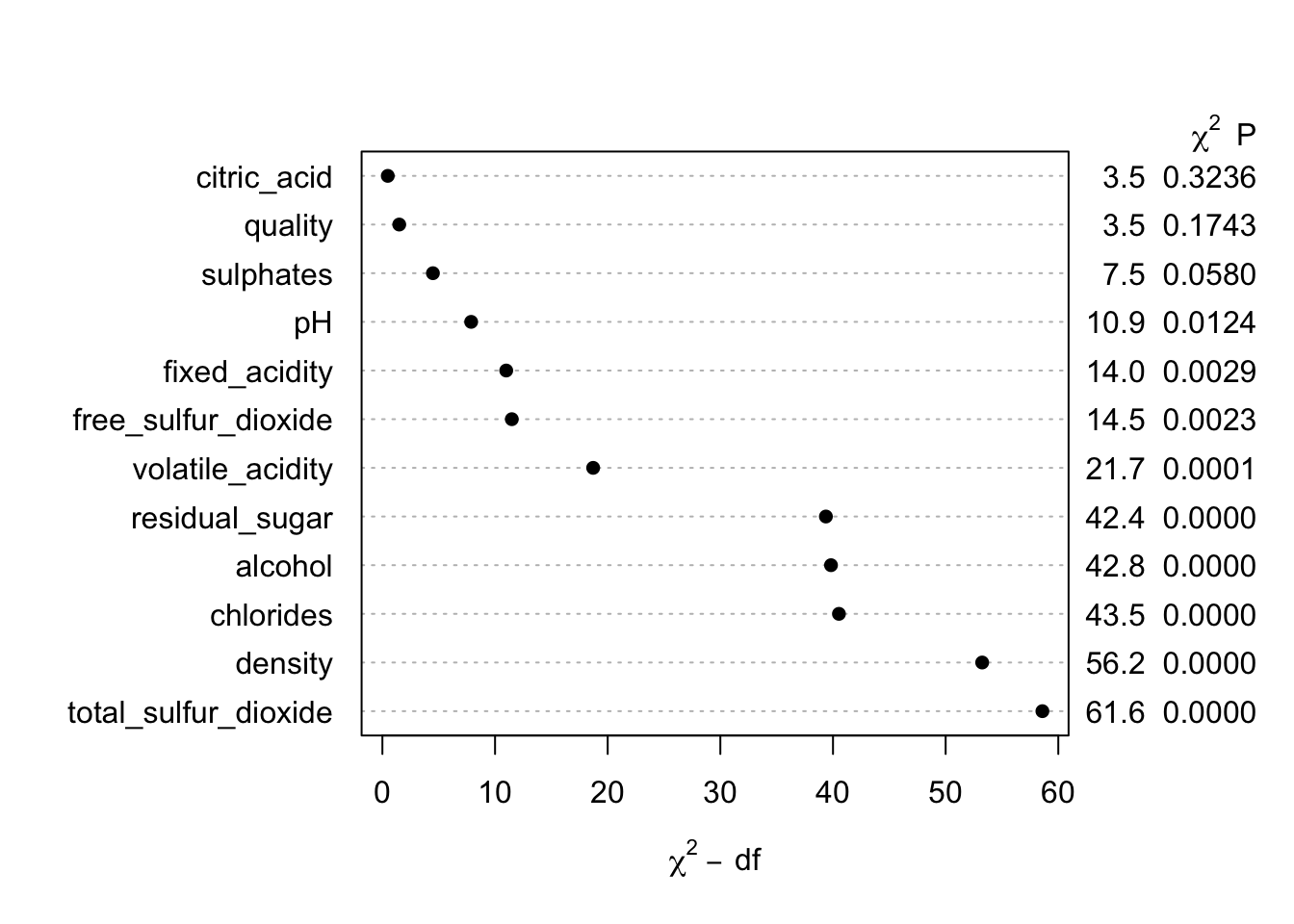
So…it looks like we can rather easily predict the type of wine from this set of features! If I would have known this, I might have selected a more difficult example problem. I suppose if I did not know at least this much, my this a second career as a sommelier is probably out of the question at this point!
Our next steps would typically be to validate the model and assess how well it is calibrated over the range of predictions, but here I want to continue an example that is a bit more similar to what I commonly see in practice (i.e. we have a set of features with moderate predictive performance). I also want to trim down the number of predictors to highlight some of the plotting functions.
Therefore, I will proceed using only two predictors that have relatively small conditional chi-square values (since even the top few predictors have excellent performance) to show some of the key functionality. The first model is a flexible additive model allowing for 3 knots for each predictor.
m2 <- lrm(red_wine ~ rcs(pH, 3) + rcs(sulphates, 3), data = mydata, x = TRUE, y = TRUE)
print(m2)
## Logistic Regression Model
##
## lrm(formula = red_wine ~ rcs(pH, 3) + rcs(sulphates, 3), data = mydata,
## x = TRUE, y = TRUE)
##
## Model Likelihood Discrimination Rank Discrim.
## Ratio Test Indexes Indexes
## Obs 6497 LR chi2 2294.01 R2 0.442 C 0.866
## 0 4898 d.f. 4 g 2.415 Dxy 0.731
## 1 1599 Pr(> chi2) <0.0001 gr 11.186 gamma 0.731
## max |deriv| 7e-07 gp 0.271 tau-a 0.271
## Brier 0.125
##
## Coef S.E. Wald Z Pr(>|Z|)
## Intercept -40.0731 2.4341 -16.46 <0.0001
## pH 8.4567 0.7536 11.22 <0.0001
## pH' -4.3193 0.7323 -5.90 <0.0001
## sulphates 23.5236 1.3365 17.60 <0.0001
## sulphates' -15.9641 1.3353 -11.96 <0.0001
## anova(m2)## Wald Statistics Response: red_wine
##
## Factor Chi-Square d.f. P
## pH 347.99 2 <.0001
## Nonlinear 34.79 1 <.0001
## sulphates 920.43 2 <.0001
## Nonlinear 142.93 1 <.0001
## TOTAL NONLINEAR 185.52 2 <.0001
## TOTAL 1205.84 4 <.0001p1 <- ggplot(Predict(m2, pH))
p2 <- ggplot(Predict(m2, sulphates))
p3 <- ggplot(Predict(m2, pH, fun = plogis))
p4 <- ggplot(Predict(m2, sulphates, fun = plogis))
cowplot::plot_grid(p1, p2, p3, p4, nrow = 2, ncol = 2, scale = .9)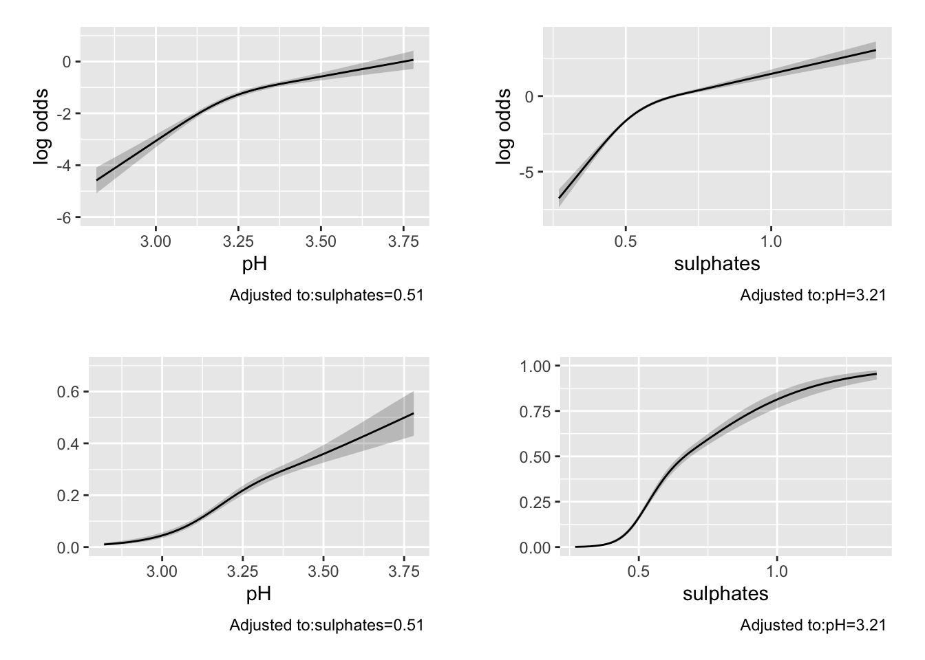
The Brier score and C-statistic suggest possible moderate predictive performance Printing the model also provides information and tests for the coefficients and non-linear terms (which may or may not be informative depending on your goals). The anova.rms function is quite impressive and automatically tests the most meaningful hypotheses in a design including Wald tests for the non-linear terms, and interactions if they were included (as we will see below), as well as chunk tests for any set of terms of interest. Here is a link with an example of the chunk test on stackexchange.
The Predict function selects plausible values to provide predictions over and can be plotted using ggplot. By default, the predictions for rms::lrm() are returned on the log-odds scale. If we provide a function to the fun = option, we can obtain the predictions on an alternative scale. Here we use the plogis function to return the predicted probabilities. These are calculated at the median value for continuous variables and at the most common level for categorical variables by default (but can be changed).
Below I use the ^2 operator to include all two-way interactions in the model (in this simple example this is a bit of overkill and other choices of syntax used). The rms::bplot() function is very cool and allows one to visualize the two-way interaction. The last line of code highlights how specific values of a feature can be provided to the rms::Predict () function. This is incredibly useful when you want to examine how multiple factors are operating. Dr. Harrell provides many example of this in his RMS textbook.
m3 <- lrm(red_wine ~ (rcs(pH, 3) + rcs(sulphates, 3))^2, data = mydata, x = TRUE, y = TRUE)
print(m3, coef = FALSE)
## Logistic Regression Model
##
## lrm(formula = red_wine ~ (rcs(pH, 3) + rcs(sulphates, 3))^2,
## data = mydata, x = TRUE, y = TRUE)
##
## Model Likelihood Discrimination Rank Discrim.
## Ratio Test Indexes Indexes
## Obs 6497 LR chi2 2333.97 R2 0.449 C 0.867
## 0 4898 d.f. 8 g 2.579 Dxy 0.734
## 1 1599 Pr(> chi2) <0.0001 gr 13.181 gamma 0.734
## max |deriv| 2e-09 gp 0.272 tau-a 0.272
## Brier 0.123anova(m3)## Wald Statistics Response: red_wine
##
## Factor Chi-Square d.f. P
## pH (Factor+Higher Order Factors) 355.42 6 <.0001
## All Interactions 35.00 4 <.0001
## Nonlinear (Factor+Higher Order Factors) 46.09 3 <.0001
## sulphates (Factor+Higher Order Factors) 887.41 6 <.0001
## All Interactions 35.00 4 <.0001
## Nonlinear (Factor+Higher Order Factors) 161.97 3 <.0001
## pH * sulphates (Factor+Higher Order Factors) 35.00 4 <.0001
## Nonlinear 6.41 3 0.0933
## Nonlinear Interaction : f(A,B) vs. AB 6.41 3 0.0933
## f(A,B) vs. Af(B) + Bg(A) 0.06 1 0.8011
## Nonlinear Interaction in pH vs. Af(B) 2.36 2 0.3073
## Nonlinear Interaction in sulphates vs. Bg(A) 2.94 2 0.2297
## TOTAL NONLINEAR 204.16 5 <.0001
## TOTAL NONLINEAR + INTERACTION 214.89 6 <.0001
## TOTAL 1159.86 8 <.0001pred_intx <- Predict(m3, 'pH','sulphates', fun = plogis, np = 75)
bplot(pred_intx, yhat ~ pH + sulphates, lfun = wireframe,
ylab = "Sulphates", zlab = "Pr(Red Wine)\n")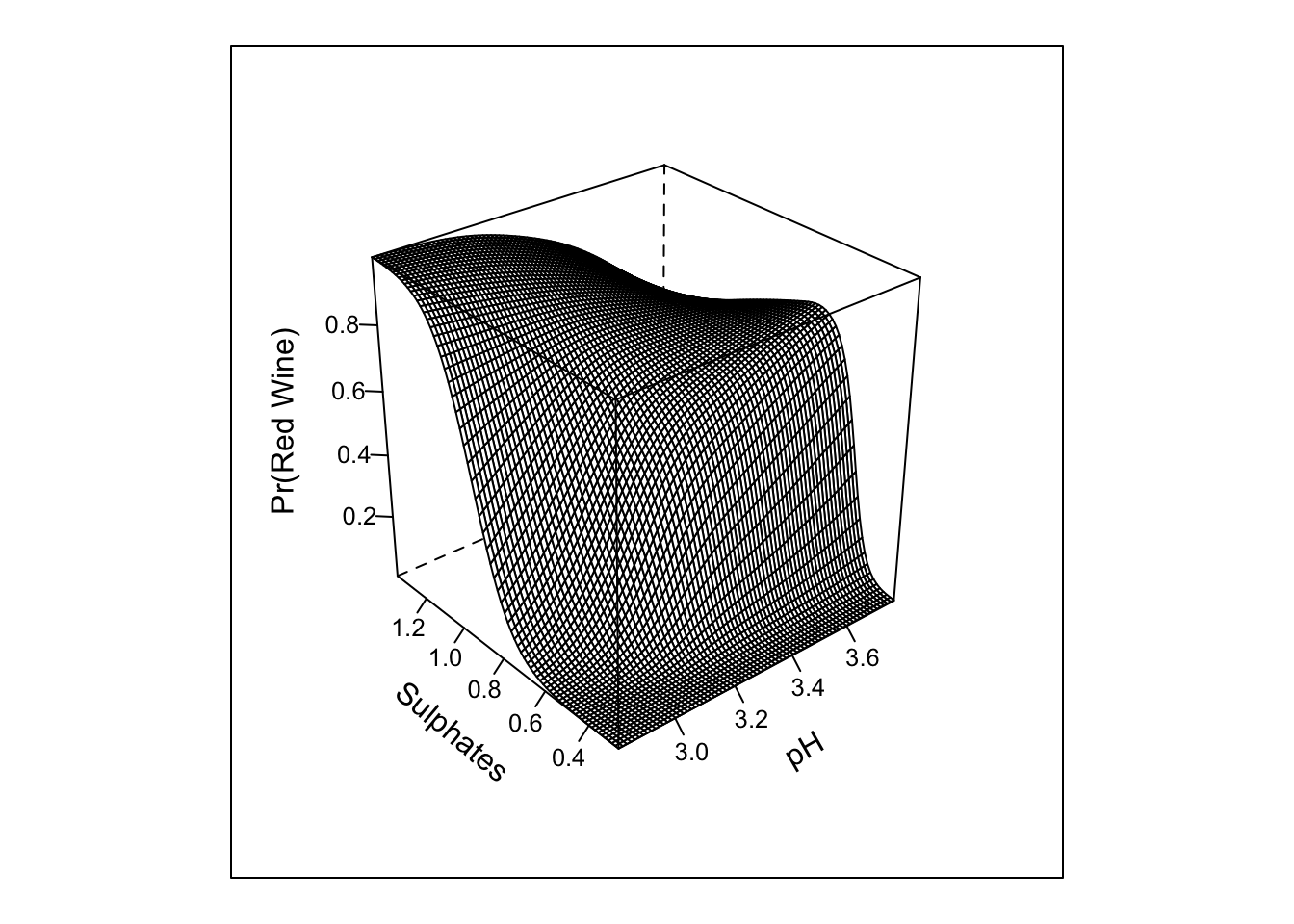
ggplot(Predict(m2, sulphates, pH = c(3.0, 3.2, 3.4), fun = plogis))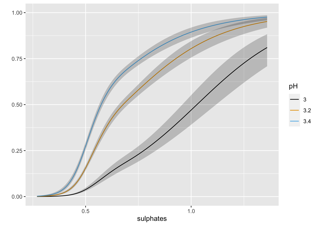
The inclusion of the interaction does not look to add much in term of the absolute or rank-based discrimination. However, this example highlights the various types of tests that anova.rms performs by default. It also allows us to see the response profile surface returned by bplot().
Let’s now go ahead and fit the restricted interaction just for instructive purposes.
#%ia% is restricted interaction - not doubly nonlinear
m4 <- lrm(red_wine ~ rcs(pH, 3) + rcs(sulphates, 3) + pH %ia% sulphates, data = mydata, x = TRUE, y = TRUE)
print(m4, coef = FALSE)
## Logistic Regression Model
##
## lrm(formula = red_wine ~ rcs(pH, 3) + rcs(sulphates, 3) + pH %ia%
## sulphates, data = mydata, x = TRUE, y = TRUE)
##
## Model Likelihood Discrimination Rank Discrim.
## Ratio Test Indexes Indexes
## Obs 6497 LR chi2 2327.12 R2 0.448 C 0.866
## 0 4898 d.f. 5 g 2.657 Dxy 0.733
## 1 1599 Pr(> chi2) <0.0001 gr 14.252 gamma 0.733
## max |deriv| 2e-11 gp 0.272 tau-a 0.272
## Brier 0.124anova(m4)## Wald Statistics Response: red_wine
##
## Factor Chi-Square d.f. P
## pH (Factor+Higher Order Factors) 362.84 3 <.0001
## All Interactions 32.25 1 <.0001
## Nonlinear 44.67 1 <.0001
## sulphates (Factor+Higher Order Factors) 883.81 3 <.0001
## All Interactions 32.25 1 <.0001
## Nonlinear 154.96 1 <.0001
## pH * sulphates (Factor+Higher Order Factors) 32.25 1 <.0001
## TOTAL NONLINEAR 198.98 2 <.0001
## TOTAL NONLINEAR + INTERACTION 205.24 3 <.0001
## TOTAL 1137.05 5 <.0001pred_intx_r <- Predict(m4, 'pH','sulphates', fun = plogis, np = 75)
bplot(pred_intx_r, yhat ~ pH + sulphates, lfun = wireframe,
ylab = "Sulphates", zlab = "Pr(Red Wine)\n")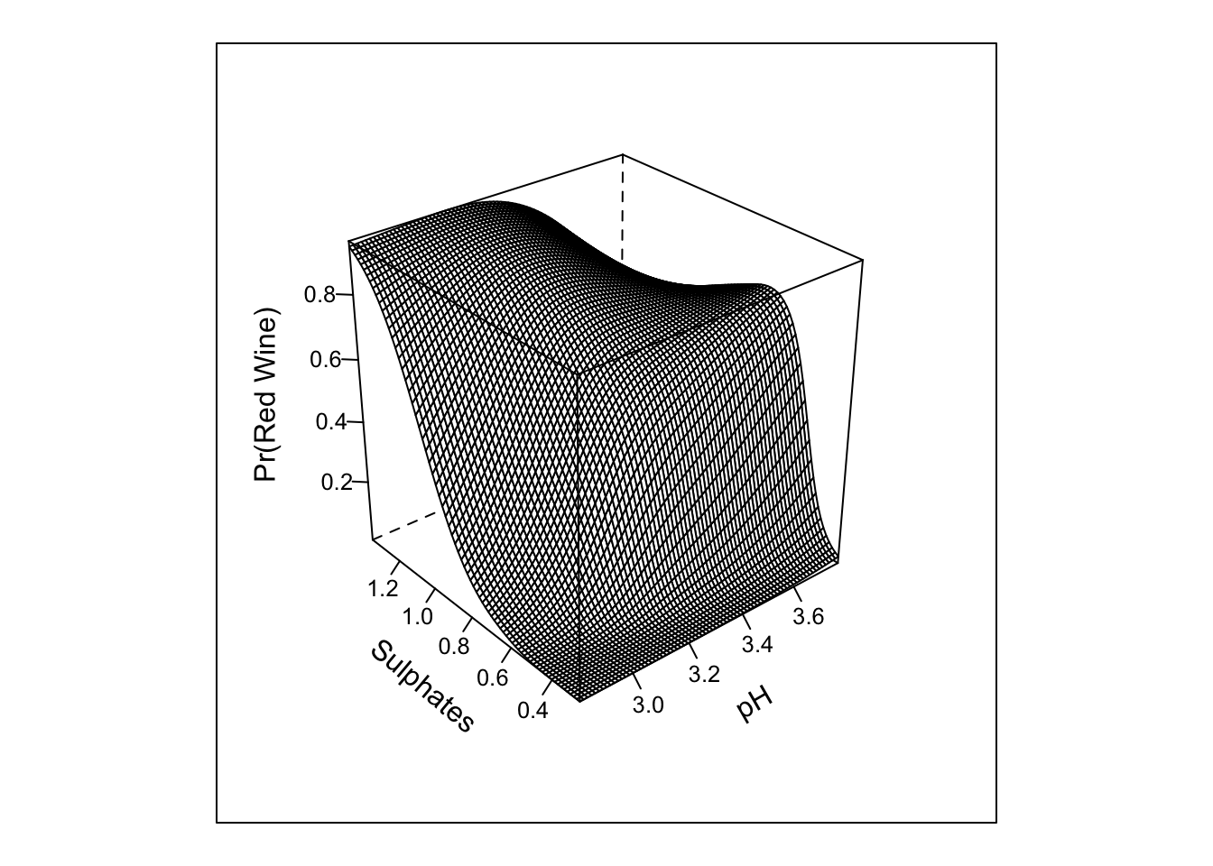
Here we can see that the results are generally unchanged; however, the restricted interaction and test is for 1 d.f.; whereas, the interaction for the cross-product term with 3 knots in each of the predictors requires 4 d.f.
The summary.rms() function can be used to obtain the log-odds and exponentiated odds ratios for each predictor. The interquartile odds ratios are provided by default. These can be easily changed, and more interesting or complex associations tested.
As with other GLMs, the rms fitted values of the rms::lrm() object can be obtained for all observations using the predict function.
summary(m4)## Effects Response : red_wine
##
## Factor Low High Diff. Effect S.E. Lower 0.95 Upper 0.95
## pH 3.11 3.32 0.21 1.4116 0.084427 1.2461 1.5770
## Odds Ratio 3.11 3.32 0.21 4.1024 NA 3.4767 4.8406
## sulphates 0.43 0.60 0.17 2.7986 0.124910 2.5538 3.0434
## Odds Ratio 0.43 0.60 0.17 16.4220 NA 12.8560 20.9770
##
## Adjusted to: pH=3.21 sulphates=0.51summary(m4, pH = c(2.97, 3.50)) #contrast of 5th verus 95th %tile## Effects Response : red_wine
##
## Factor Low High Diff. Effect S.E. Lower 0.95 Upper 0.95
## pH 2.97 3.5 0.53 3.4147 0.19978 3.0231 3.8062
## Odds Ratio 2.97 3.5 0.53 30.4070 NA 20.5550 44.9800
## sulphates 0.43 0.6 0.17 2.7986 0.12491 2.5538 3.0434
## Odds Ratio 0.43 0.6 0.17 16.4220 NA 12.8560 20.9770
##
## Adjusted to: pH=3.21 sulphates=0.51r <- mydata
r$fitted <- predict(m4, type = "fitted")
head(r$fitted)## [1] 0.5605529 0.5164138 0.5470583 0.2846203 0.5605529 0.5605529
Tip 3. Validating fitted models with rms::validate() and rms:calibrate()
In Chapter 5 of the RMS textbook, the bootstrap procure is advocated for obtaining nearly unbiased estimates of a model’s future performance using resampling. The rms::validate() function implements this procedure to return bias-corrected indexes that are specific to each type of model. There are many indices of performance that are returned! Use ?validate.lrm to get further information on each metric. The steps performed to obtain optimism correct estimates based on bootstrap resampling are:
- Estimate model performance in the original sample of size n
- Draw a bootstrap sample of the same size n and fit the model to the bootstrap sample
- Apply the model obtained in the bootstrap sample to the original sample
- Subtract the accuracy measure found in the bootstrap sample from the accuracy measure in the original sample - this is the estimate of optimism (i.e. overfitting)
- Repeat the process many times and average over the repeats to obtain a final estimate of optimism for each measure
- Subtract that value from the observed/apparent accuracy measure to get the optimism corrected estimate
Alternative approaches such as cross-validation or .632 resampling can also be implemented. Below is an example using 200 bootstrap resamples. The second line of code computes the C-statistic (a.k.a. area under the ROC curve) from Somer’s D. There is a lot going on here…but, the validate function abstracts most of it away!
(val <- validate(m4, B = 200))## index.orig training test optimism index.corrected n
## Dxy 0.7329 0.7329 0.7324 0.0005 0.7324 200
## R2 0.4477 0.4479 0.4471 0.0008 0.4469 200
## Intercept 0.0000 0.0000 0.0030 -0.0030 0.0030 200
## Slope 1.0000 1.0000 0.9963 0.0037 0.9963 200
## Emax 0.0000 0.0000 0.0013 0.0013 0.0013 200
## D 0.3580 0.3581 0.3574 0.0007 0.3573 200
## U -0.0003 -0.0003 0.0000 -0.0003 0.0000 200
## Q 0.3583 0.3584 0.3574 0.0010 0.3573 200
## B 0.1237 0.1235 0.1238 -0.0003 0.1240 200
## g 2.6569 2.6671 2.6562 0.0109 2.6460 200
## gp 0.2719 0.2716 0.2716 0.0000 0.2719 200(c_opt_corr <- 0.5 * (val[1, 5] + 1))## [1] 0.8662209Here we see little evidence of overfitting. This would be expected given the large sample size and small model d.f. However, the difference between the apparent and optimism-corrected estimates can be quite large when estimating complex models on small data sets; suggesting the potential for worse performance when fit to new data. Good information on the number of subjects required to fit predictive models for continuous and binary outcomes to limit overfitting can be found in this excellent set of papers by Richard Riley and colleagues.
Calibration is an integral component of model validation and aims to gauge how well the model predictions fit observed data (over the full range of values). Bootstrap resampling can be used to obtain out-of-sample estimates of model performance for calibration as well.
rms::calibrate() uses bootstrapping or cross-validation to get bias-corrected (overfitting-corrected) estimates of predicted vs. observed values based on sub-setting predictions over a sequence of predicted values. The function shows the ideal, apparent, and optimism-corrected calibration curves. It also provides a histogram highlighting the density of predictions.
Here is an example.
cal <- calibrate(m4, B = 200)
plot(cal)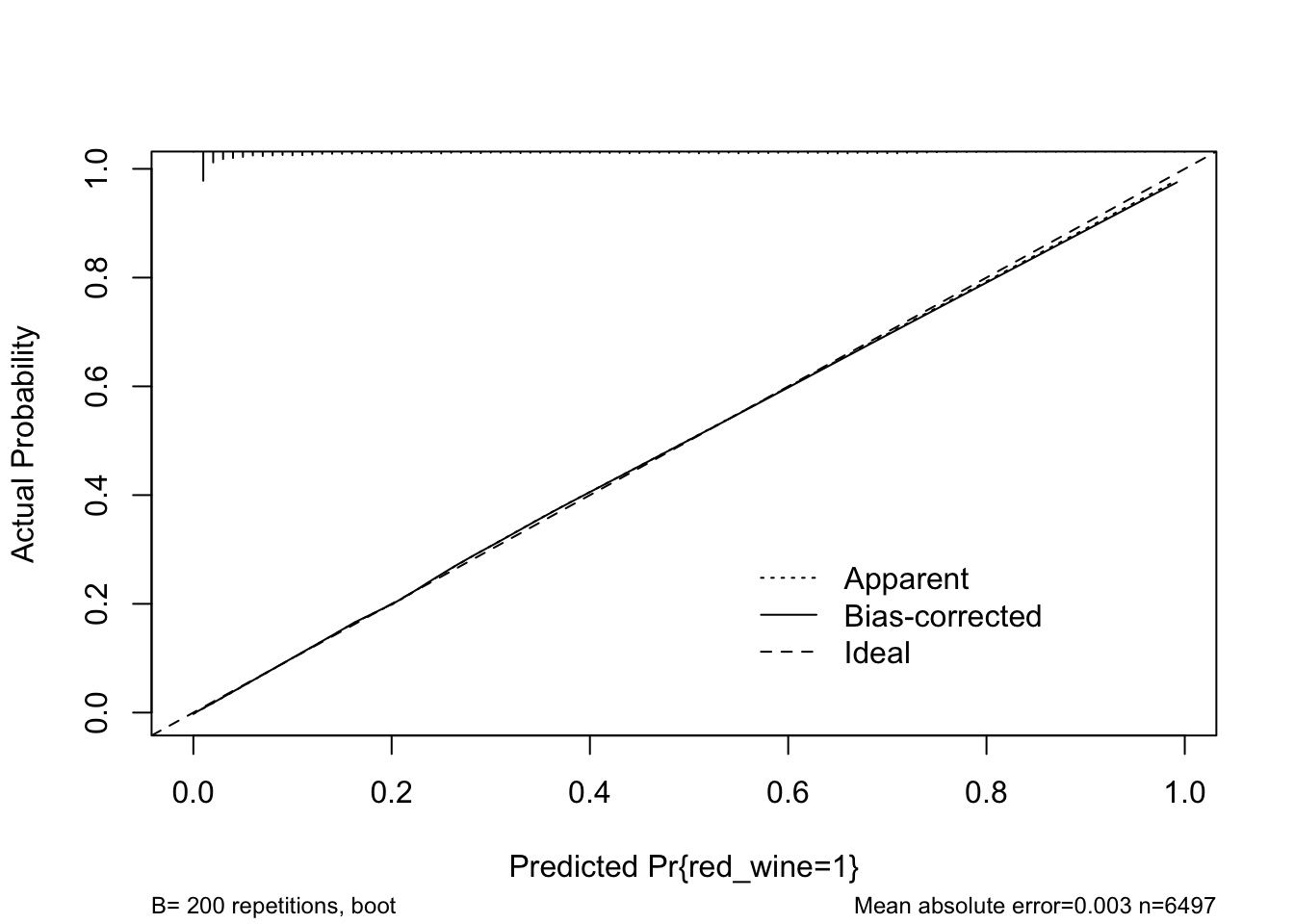
##
## n=6497   Mean absolute error=0.003   Mean squared error=1e-05
## 0.9 Quantile of absolute error=0.006
The model looks to fit well over the range of predicted probabilities. Thus, given the limited optimism, and excellent calibration, we might expect this model to perform well in a new sample.
Tip 4. Penalized regression with rms::pentrace()
Penalized regression can be used to improve the performance of a model when fit to new data by reducing the impact of extreme coefficients. This is a form of bias-variance trade-off off where we can downwardly bias the coefficients to improve the error in new data. Penalized regression is similar to ridge regression in that it is an “L-2” penalty that leaves all terms in the model, but shrinks them towards zero. It is implemented here using penalized maximum likelihood estimation. For those of you familiar with Bayesian statistics, this approach can be thought of as a “frequentist way” to bring in the idea of a “skeptical prior” into the model building exercise. The less weight we want to assign to the raw coefficients, the more we can shrink them. The benefits being potentially improved predictions in new data and reduced effective degrees of freedom. However, there is some work to from Ben Van Calster, Maarten van Smeden, Ewout W. Steyerberg for example, that suggest that while shrinkage improves predictions on average, it can perform poorly in individual datasets and does not typically solve problems associated with small sample size or low number of events per variable. So it is not a panacea for not collecting enough data.
A particularly useful function in rms::pentrace() is that the main effect terms can receive different penalties (shrinkage factors) than, for example, the non-linear terms or interactions. Thus, it provides a very nice approach to allow for model complexity, while shrinking some/all estimates depending on need.
While for these data little adjustment for overfitting is needed, we will apply pentrace function for instructional purposes. Here the AIC.c is sought to be maximized and the penalty value identified via a grid search. We see that little penalization is required to achieve the maximum AIC.c and that the effective d.f. are reduced in the penalized models.
pentrace(m4, seq(.01, .1, by = .01))##
## Best penalty:
##
## penalty df
## 0.01 4.981253
##
## penalty df aic bic aic.c
## 0.00 5.000000 2317.119 2283.224 2317.110
## 0.01 4.981253 2317.137 2283.369 2317.128
## 0.02 4.963194 2317.118 2283.472 2317.109
## 0.03 4.945779 2317.066 2283.538 2317.057
## 0.04 4.928972 2316.984 2283.570 2316.975
## 0.05 4.912738 2316.876 2283.572 2316.867
## 0.06 4.897045 2316.743 2283.546 2316.735
## 0.07 4.881863 2316.590 2283.495 2316.581
## 0.08 4.867167 2316.417 2283.422 2316.408
## 0.09 4.852930 2316.227 2283.328 2316.218
## 0.10 4.839131 2316.021 2283.217 2316.013m5 <- update(m4, penalty = .01)
m5## Logistic Regression Model
##
## lrm(formula = red_wine ~ rcs(pH, 3) + rcs(sulphates, 3) + pH %ia%
## sulphates, data = mydata, x = TRUE, y = TRUE, penalty = 0.01)
##
##
## Penalty factors
##
## simple nonlinear interaction nonlinear.interaction
## 0.01 0.01 0.01 0.01
##
## Model Likelihood Discrimination Rank Discrim.
## Ratio Test Indexes Indexes
## Obs 6497 LR chi2 2327.10 R2 0.448 C 0.866
## 0 4898 d.f. 4.981 g 2.649 Dxy 0.733
## 1 1599 Pr(> chi2)<0.0001 gr 14.138 gamma 0.733
## max |deriv| 1e-11 Penalty 1.15 gp 0.272 tau-a 0.272
## Brier 0.124
##
## Coef S.E. Wald Z Pr(>|Z|) Penalty Scale
## Intercept -63.7296 4.9458 -12.89 <0.0001 0.0000
## pH 15.5212 1.4868 10.44 <0.0001 0.0161
## pH' -5.0190 0.7531 -6.66 <0.0001 0.0140
## sulphates 58.7949 6.4401 9.13 <0.0001 0.0149
## sulphates' -17.6434 1.4195 -12.43 <0.0001 0.0127
## pH * sulphates -10.3680 1.8527 -5.60 <0.0001 0.0499
## pentrace(m4, list(simple = 0.01, nonlinear = c(0, 0.01, 0.02, 0.03), interaction = c(0, 0.01, 0.02, 0.03)))##
## Best penalty:
##
## simple nonlinear interaction df
## 0.01 0.02 0.02 4.972499
##
## simple nonlinear interaction df aic bic aic.c
## 0.01 0.01 0.01 4.981253 2317.137 2283.369 2317.128
## 0.01 0.01 0.02 4.972933 2317.139 2283.427 2317.130
## 0.01 0.02 0.02 4.972499 2317.139 2283.430 2317.130
## 0.01 0.01 0.03 4.964759 2317.136 2283.479 2317.127
## 0.01 0.02 0.03 4.964326 2317.136 2283.483 2317.127
## 0.01 0.03 0.03 4.963893 2317.137 2283.486 2317.127m6 <- update(m4, penalty = .01)
m6## Logistic Regression Model
##
## lrm(formula = red_wine ~ rcs(pH, 3) + rcs(sulphates, 3) + pH %ia%
## sulphates, data = mydata, x = TRUE, y = TRUE, penalty = 0.01)
##
##
## Penalty factors
##
## simple nonlinear interaction nonlinear.interaction
## 0.01 0.01 0.01 0.01
##
## Model Likelihood Discrimination Rank Discrim.
## Ratio Test Indexes Indexes
## Obs 6497 LR chi2 2327.10 R2 0.448 C 0.866
## 0 4898 d.f. 4.981 g 2.649 Dxy 0.733
## 1 1599 Pr(> chi2)<0.0001 gr 14.138 gamma 0.733
## max |deriv| 1e-11 Penalty 1.15 gp 0.272 tau-a 0.272
## Brier 0.124
##
## Coef S.E. Wald Z Pr(>|Z|) Penalty Scale
## Intercept -63.7296 4.9458 -12.89 <0.0001 0.0000
## pH 15.5212 1.4868 10.44 <0.0001 0.0161
## pH' -5.0190 0.7531 -6.66 <0.0001 0.0140
## sulphates 58.7949 6.4401 9.13 <0.0001 0.0149
## sulphates' -17.6434 1.4195 -12.43 <0.0001 0.0127
## pH * sulphates -10.3680 1.8527 -5.60 <0.0001 0.0499
## effective.df(m6)##
## Original and Effective Degrees of Freedom
##
## Original Penalized
## All 5 4.98
## Simple Terms 2 1.99
## Interaction or Nonlinear 3 2.99
## Nonlinear 2 2.00
## Interaction 1 0.99
## Nonlinear Interaction 0 0.00
Tip 5. Models other than OLS for continuous or semi-continuous Y
A nice feature of the rms package is that one can use it to fit a wide range of models. For example, if we want to make predictions regarding a conditional quantile, rms wraps Roger Koenker’s quantreg package allowing for most of the benefits of the rms package to applied to quantile regression models. The only limitation I am aware of is that when using rms one can only model a single value of tau (quantile) at a time. If one wishes to model ordinal or semi-continuous data, the rms::orm() function fits ordinal cumulative probability models for continuous or ordinal response variables. In addition, the package can be used to fit OLS regression, survival models, generalized least squares for longitudinal data, etc.
Models other than OLS may come in handy when modeling a continuous outcome and one want to make “less restrictive” assumptions regarding the distribution of Y given X. Quantile regression only requires that Y|X be continuous. The proportional odds model only assumes that the association is the same for all outcome groups (i.e. proportional odds or parallel regression assumption). So, if one does not want to rely on the central limit theorem when making predictions, these alternative approaches can be considered depending on your goals.
Below we fit a fairly simple two-term model with non-linear terms and interactions to predict values of residual sugar from pH and sulphates. OLS, ordinal, and quantile regression models are fit to the data and various predictions made.
lm1 <- ols(residual_sugar ~ (rcs(pH, 3) + rcs(sulphates, 3))^2, data = mydata, x = TRUE, y = TRUE)
print(lm1, coefs = FALSE)
## Linear Regression Model
##
## ols(formula = residual_sugar ~ (rcs(pH, 3) + rcs(sulphates, 3))^2,
## data = mydata, x = TRUE, y = TRUE)
##
## Model Likelihood Discrimination
## Ratio Test Indexes
## Obs 6497 LR chi2 710.48 R2 0.104
## sigma4.5074 d.f. 8 R2 adj 0.102
## d.f. 6488 Pr(> chi2) 0.0000 g 1.719
##
## Residuals
##
## Min 1Q Median 3Q Max
## -9.967 -3.202 -1.174 2.444 62.425
## r <- mydata
r$resid <- resid(lm1)
r$fitted <- fitted(lm1)
r1 <- ggplot(data = r, aes(x = fitted, y = resid)) + geom_point() + geom_smooth()
r2 <- ggplot(data = r, aes(x = pH, y = resid)) + geom_point() + geom_smooth()
r3 <- ggplot(data = r, aes(x = sulphates, y = resid)) + geom_point() + geom_smooth()
r4 <- ggplot(data = r, aes(sample = resid)) + stat_qq() + geom_abline(intercept = mean(r$resid), slope = sd(r$resid))
cowplot::plot_grid(r1, r2, r3, r4, nrow = 2, ncol = 2, scale = .9)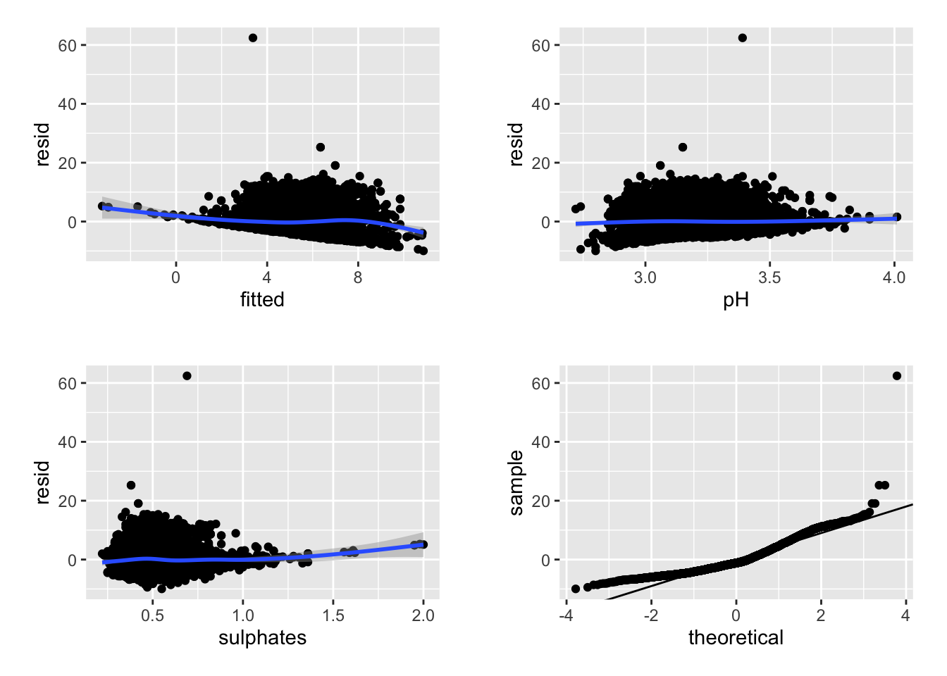
ggplot(Predict(lm1, sulphates, pH = c(3, 3.2, 3.4)))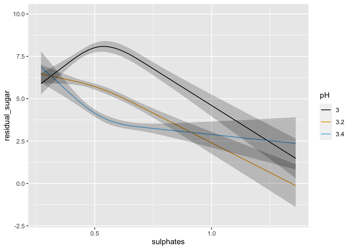
We can see above that neither the r-squared value nor the model fit is great. However, the effect of pH and sulphates does look to interact in a non-linear manner when predicting residual sugar. We could further examine the model predictions at this time or consider some type of transformation, etc. or alternative model.
We will fit a log-log proportional odds model as implemented by rms::orm() to these data and obtain mean and median predictions for residual sugar as a function of pH and sulphates.
orm1 <- orm(residual_sugar ~ (rcs(pH, 3) + rcs(sulphates, 3))^2, data = mydata, x = TRUE, y = TRUE)
print(orm1, coefs = FALSE)
## Logistic (Proportional Odds) Ordinal Regression Model
##
## orm(formula = residual_sugar ~ (rcs(pH, 3) + rcs(sulphates, 3))^2,
## data = mydata, x = TRUE, y = TRUE)
##
## Model Likelihood Discrimination Rank Discrim.
## Ratio Test Indexes Indexes
## Obs 6497 LR chi2 476.63 R2 0.071 rho 0.268
## Distinct Y 316 d.f. 8 g 0.542
## Median Y 3 Pr(> chi2) <0.0001 gr 1.720
## max |deriv| 2e-05 Score chi2 482.68 |Pr(Y>=median)-0.5| 0.098
## Pr(> chi2) <0.0001M <- Mean(orm1)
qu <- Quantile(orm1)
med <- function(x) qu(0.5, x)
p1 <- ggplot(Predict(orm1, sulphates, pH = c(3, 3.2, 3.4), fun = M)) + coord_cartesian(ylim = c(1, 8))
p2 <- ggplot(Predict(orm1, sulphates, pH = c(3, 3.2, 3.4), fun = med)) + coord_cartesian(ylim = c(1, 8))
plot_grid(p1, p2, nrow = 1, ncol = 2, scale = 0.9, labels = c("ORM: Mean", "ORM: Median"))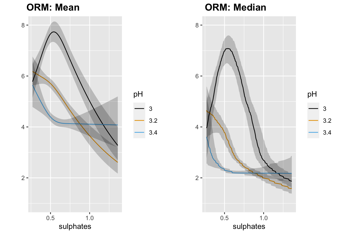
We generally see the same pattern as we did with OLS.
No lets try the rms::Rq function to predcit the median value from this same set of predictors.
rq1 <- Rq(residual_sugar ~ (rcs(pH, 3) + rcs(sulphates, 3))^2, data = mydata, x = TRUE, y = TRUE, tau = 0.5)
print(rq1, coefs = FALSE)
## Quantile Regression tau: 0.5
##
## Rq(formula = residual_sugar ~ (rcs(pH, 3) + rcs(sulphates, 3))^2,
## tau = 0.5, data = mydata, x = TRUE, y = TRUE)
##
## Discrimination
## Index
## Obs 6497 g 1.971
## p 9
## Residual d.f. 6488
## mean |Y-Yhat| 3.345058ggplot(Predict(rq1, sulphates, pH = c(3, 3.2, 3.4)))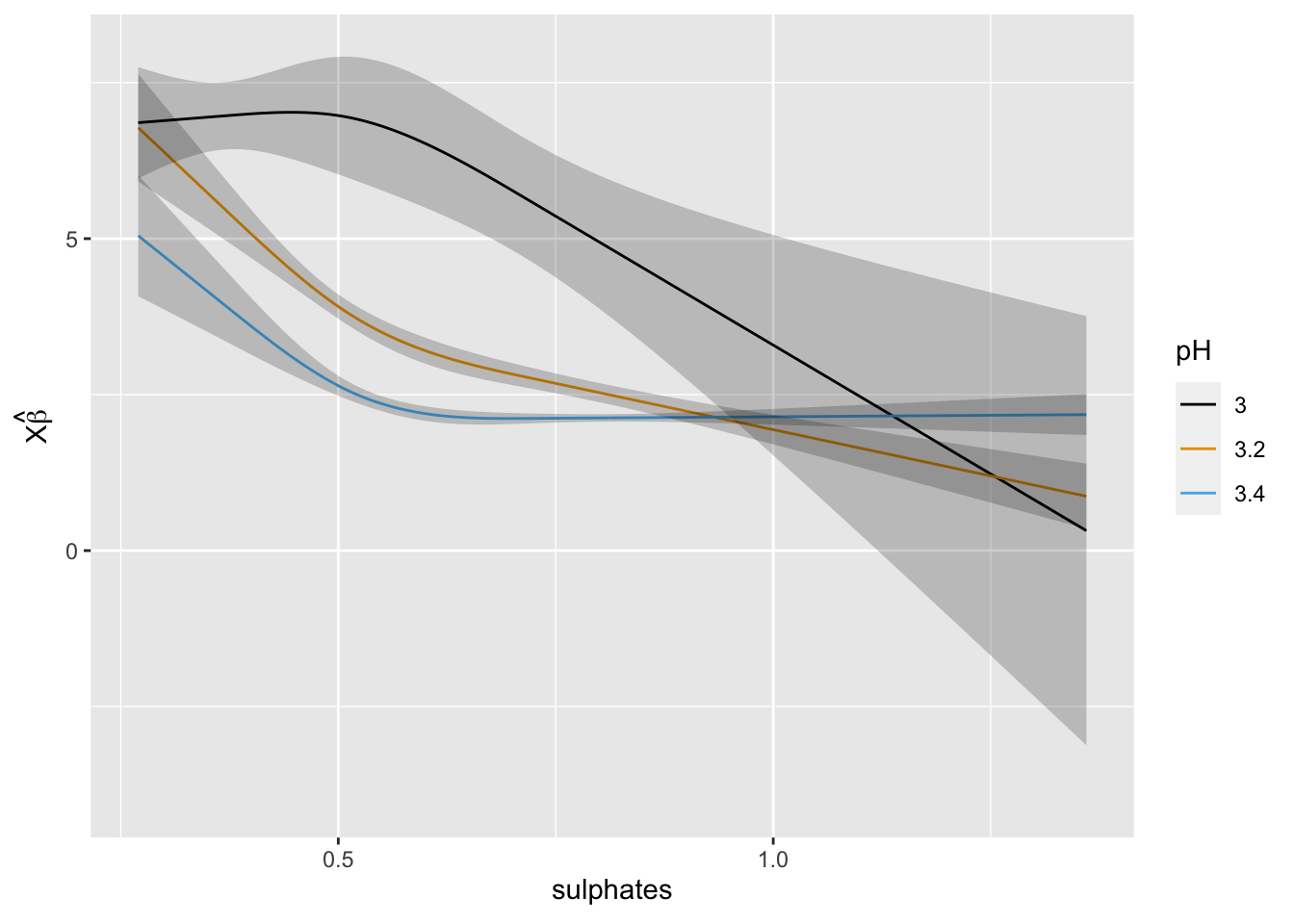
At this point we could compare the optimism-corrected estimates of model performance and the calibration curves to assess performance. We could also model other quantiles by changing tau to see if the impact of the predictors differs across quantiles of residual sugar.
Bonus: taking predictions outside of R
If you want to take your predictions outside of R, to drop them into a java script for web-based visualization for example, the rms::Function() will output the R code used to make the model predictions.
(pred_logit <- Function(m4))## function (pH = 3.21, sulphates = 0.51)
## {
## -64.339385 + 15.699039 * pH - 31.487899 * pmax(pH - 3.02,
## 0)^3 + 59.976951 * pmax(pH - 3.21, 0)^3 - 28.489052 *
## pmax(pH - 3.42, 0)^3 + 59.695226 * sulphates - 144.55604 *
## pmax(sulphates - 0.37, 0)^3 + 240.92673 * pmax(sulphates -
## 0.51, 0)^3 - 96.370692 * pmax(sulphates - 0.72, 0)^3 -
## 10.624164 * pH * sulphates
## }
## <environment: 0x7f8c1b174328>
Session Info
sessionInfo()## R version 4.0.2 (2020-06-22)
## Platform: x86_64-apple-darwin17.0 (64-bit)
## Running under: macOS Catalina 10.15.6
##
## Matrix products: default
## BLAS: /Library/Frameworks/R.framework/Versions/4.0/Resources/lib/libRblas.dylib
## LAPACK: /Library/Frameworks/R.framework/Versions/4.0/Resources/lib/libRlapack.dylib
##
## locale:
## [1] en_US.UTF-8/en_US.UTF-8/en_US.UTF-8/C/en_US.UTF-8/en_US.UTF-8
##
## attached base packages:
## [1] stats graphics grDevices utils datasets methods base
##
## other attached packages:
## [1] cowplot_1.1.0 ucidata_0.0.3 rms_6.0-1 SparseM_1.78
## [5] Hmisc_4.4-1 Formula_1.2-3 survival_3.1-12 lattice_0.20-41
## [9] forcats_0.5.0 stringr_1.4.0 dplyr_1.0.2 purrr_0.3.4
## [13] readr_1.3.1 tidyr_1.1.2 tibble_3.0.3 ggplot2_3.3.2
## [17] tidyverse_1.3.0
##
## loaded via a namespace (and not attached):
## [1] nlme_3.1-148 matrixStats_0.56.0 fs_1.5.0
## [4] lubridate_1.7.9 RColorBrewer_1.1-2 httr_1.4.2
## [7] tools_4.0.2 backports_1.1.9 R6_2.5.0
## [10] rpart_4.1-15 mgcv_1.8-31 DBI_1.1.0
## [13] colorspace_1.4-1 nnet_7.3-14 withr_2.2.0
## [16] tidyselect_1.1.0 gridExtra_2.3 compiler_4.0.2
## [19] cli_2.0.2 rvest_0.3.6 quantreg_5.67
## [22] htmlTable_2.0.1 xml2_1.3.2 sandwich_2.5-1
## [25] labeling_0.3 bookdown_0.21 scales_1.1.1
## [28] checkmate_2.0.0 mvtnorm_1.1-1 polspline_1.1.19
## [31] digest_0.6.27 foreign_0.8-80 rmarkdown_2.5
## [34] base64enc_0.1-3 jpeg_0.1-8.1 pkgconfig_2.0.3
## [37] htmltools_0.5.0 dbplyr_1.4.4 htmlwidgets_1.5.1
## [40] rlang_0.4.8 readxl_1.3.1 rstudioapi_0.11
## [43] farver_2.0.3 generics_0.0.2 zoo_1.8-8
## [46] jsonlite_1.7.1 magrittr_2.0.1 Matrix_1.2-18
## [49] Rcpp_1.0.5 munsell_0.5.0 fansi_0.4.1
## [52] lifecycle_0.2.0 multcomp_1.4-13 stringi_1.5.3
## [55] yaml_2.2.1 MASS_7.3-51.6 grid_4.0.2
## [58] blob_1.2.1 crayon_1.3.4 haven_2.3.1
## [61] splines_4.0.2 hms_0.5.3 knitr_1.30
## [64] pillar_1.4.6 codetools_0.2-16 reprex_0.3.0
## [67] glue_1.4.2 evaluate_0.14 blogdown_0.21.45
## [70] latticeExtra_0.6-29 data.table_1.13.0 modelr_0.1.8
## [73] png_0.1-7 vctrs_0.3.4 MatrixModels_0.4-1
## [76] cellranger_1.1.0 gtable_0.3.0 assertthat_0.2.1
## [79] xfun_0.19 broom_0.7.0 conquer_1.0.2
## [82] cluster_2.1.0 TH.data_1.0-10 ellipsis_0.3.1